The challenge
The project focused on a food-cart ordering experience for customers with limited time to prepare meals. The goal was to make browsing, ordering, and pickup easier to navigate.
I owned the design process from user research and early wireframes to usability testing, iteration, and a high-fidelity prototype.
Scheduling and food details shaped the priorities
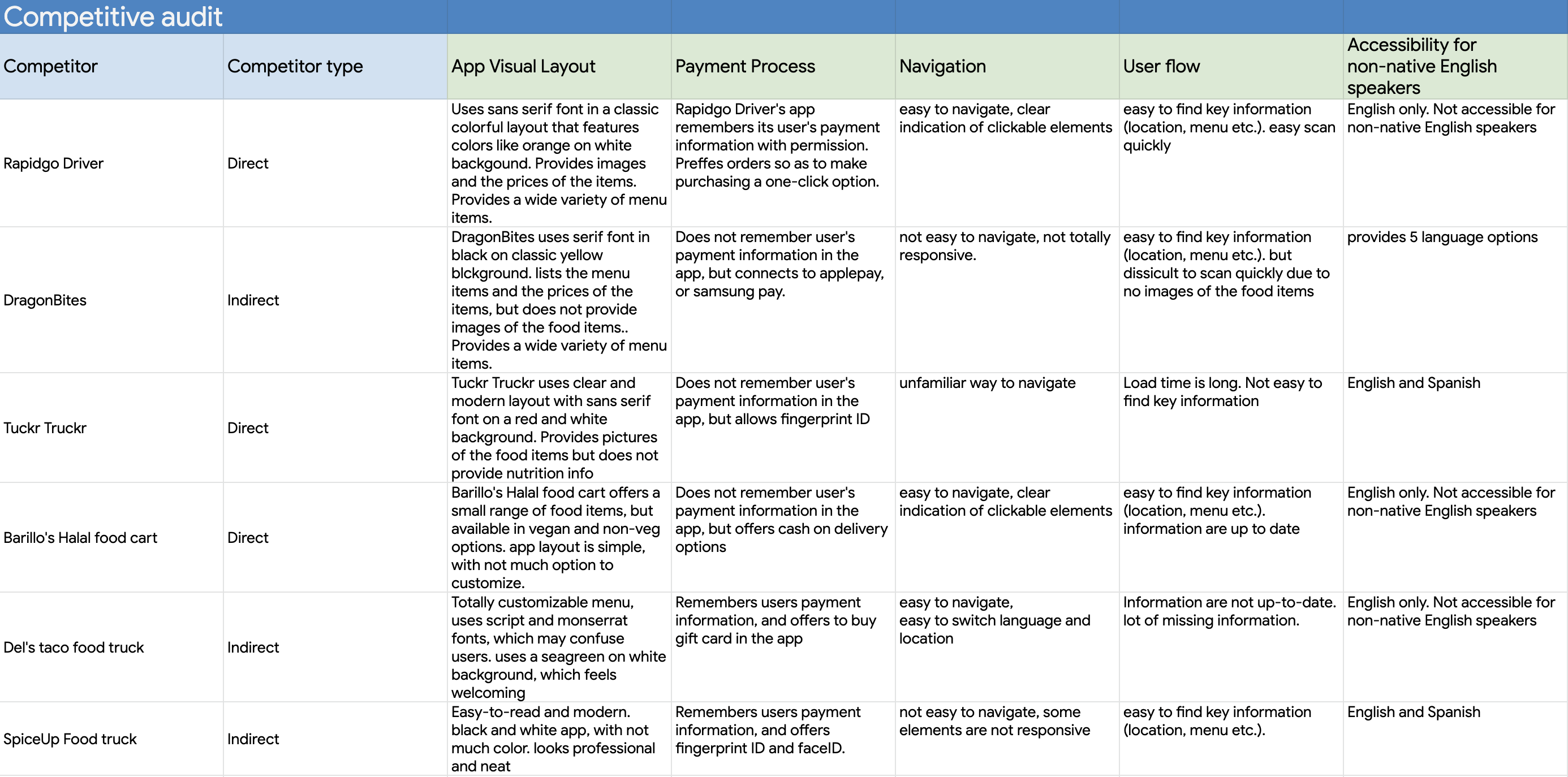
I interviewed target users to understand their ordering needs and reviewed six competing experiences. The competitive audit compared visual layout, payment, navigation, user flow, and language options.
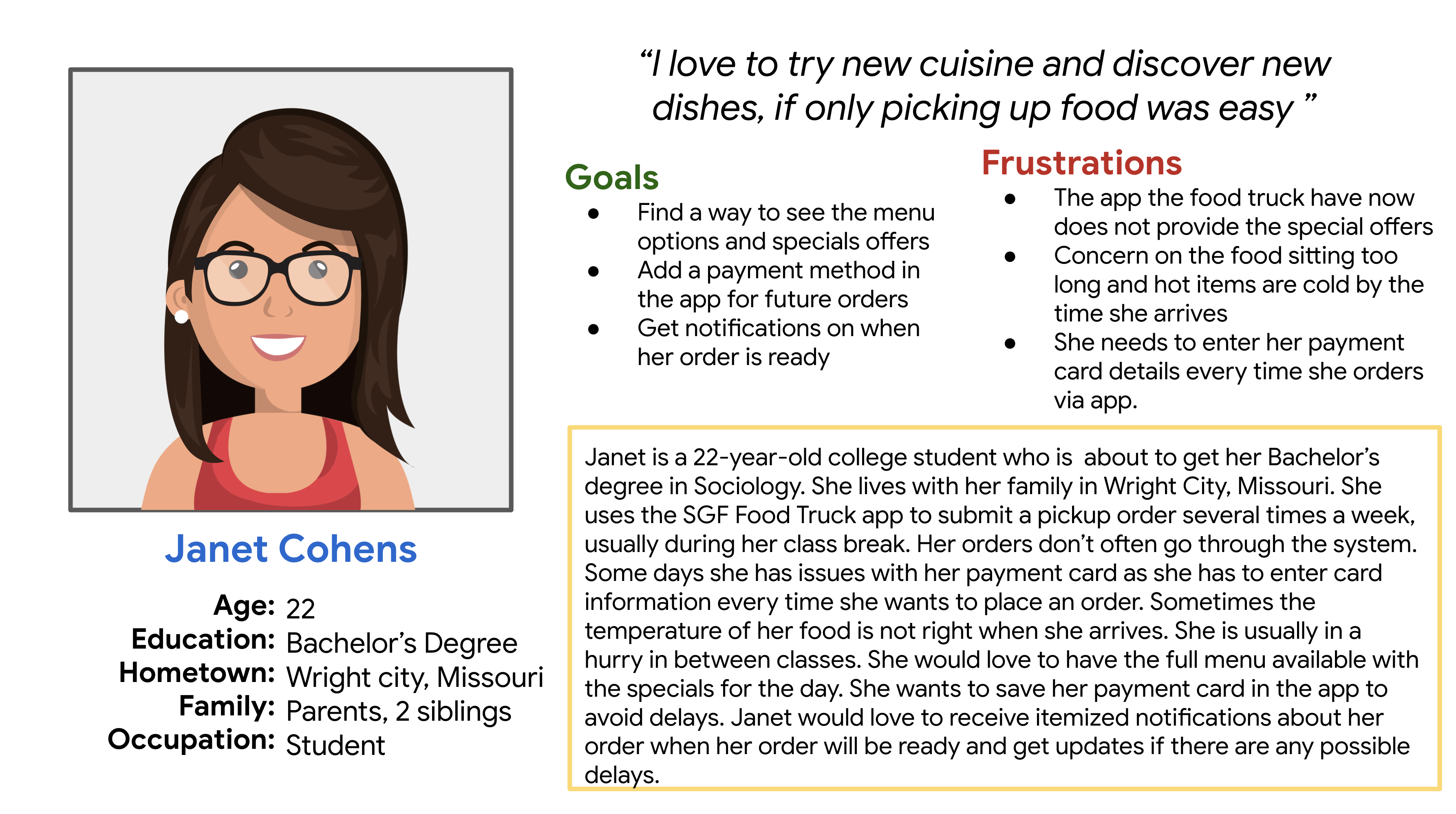
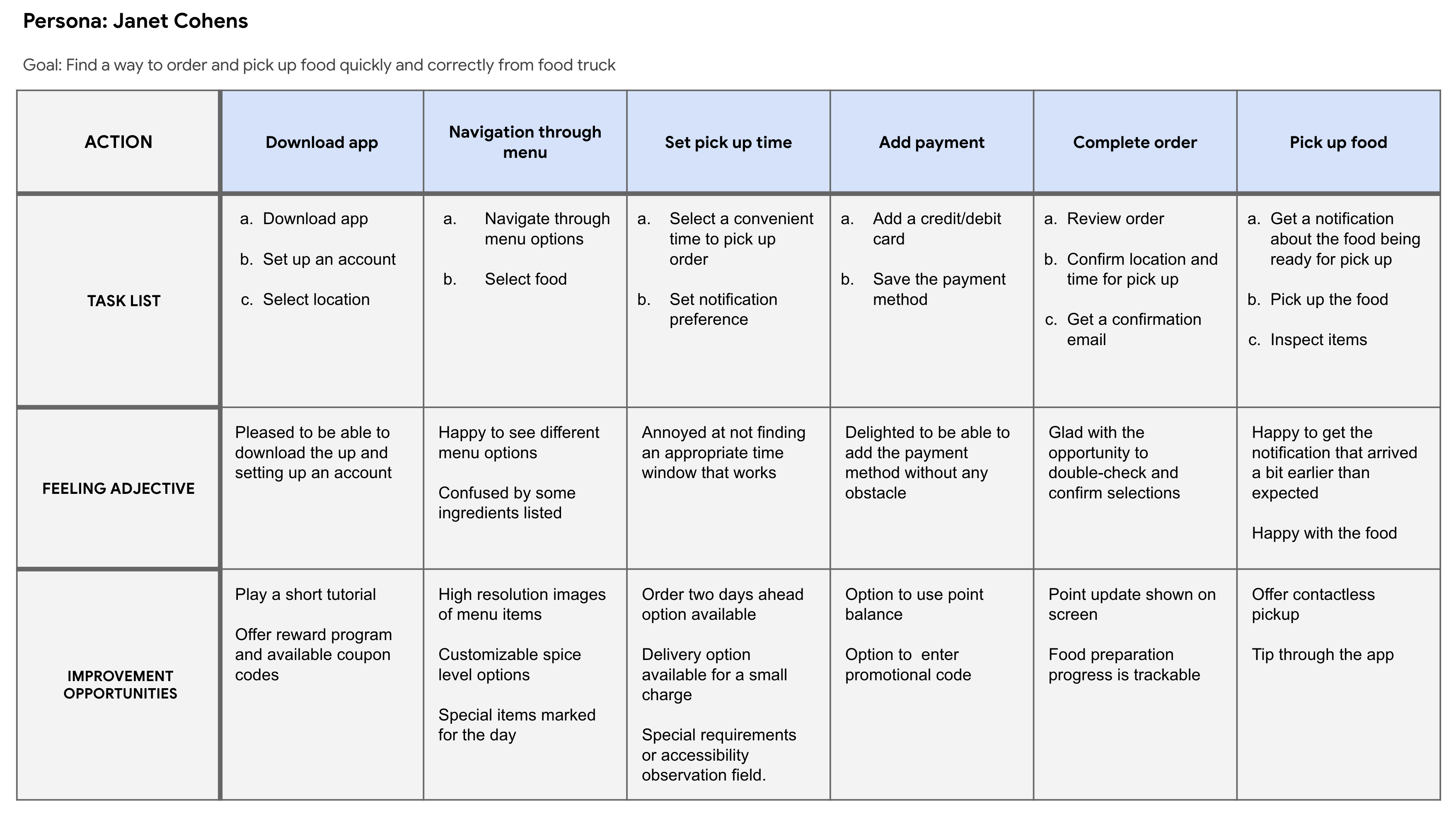
Ingredient, nutrition, and allergen information emerged as important considerations for choosing food. I used provisional personas and journey mapping to explore the steps from finding a meal to collecting an order. The journey map highlighted scheduling and ingredient clarity as questions to investigate in the prototype.
View research artifacts
Connecting meal selection to pickup and payment
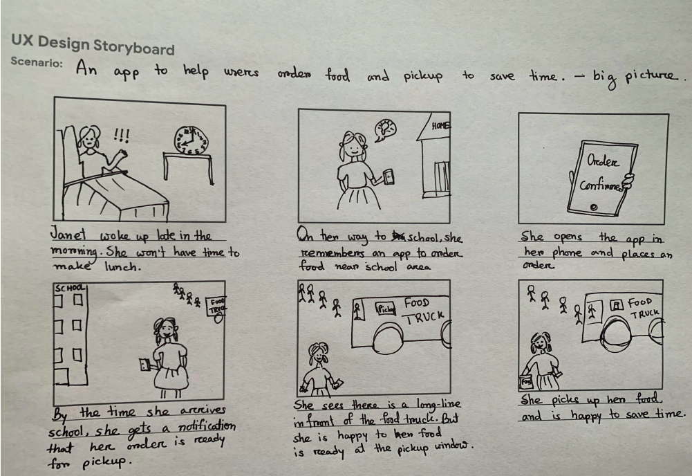
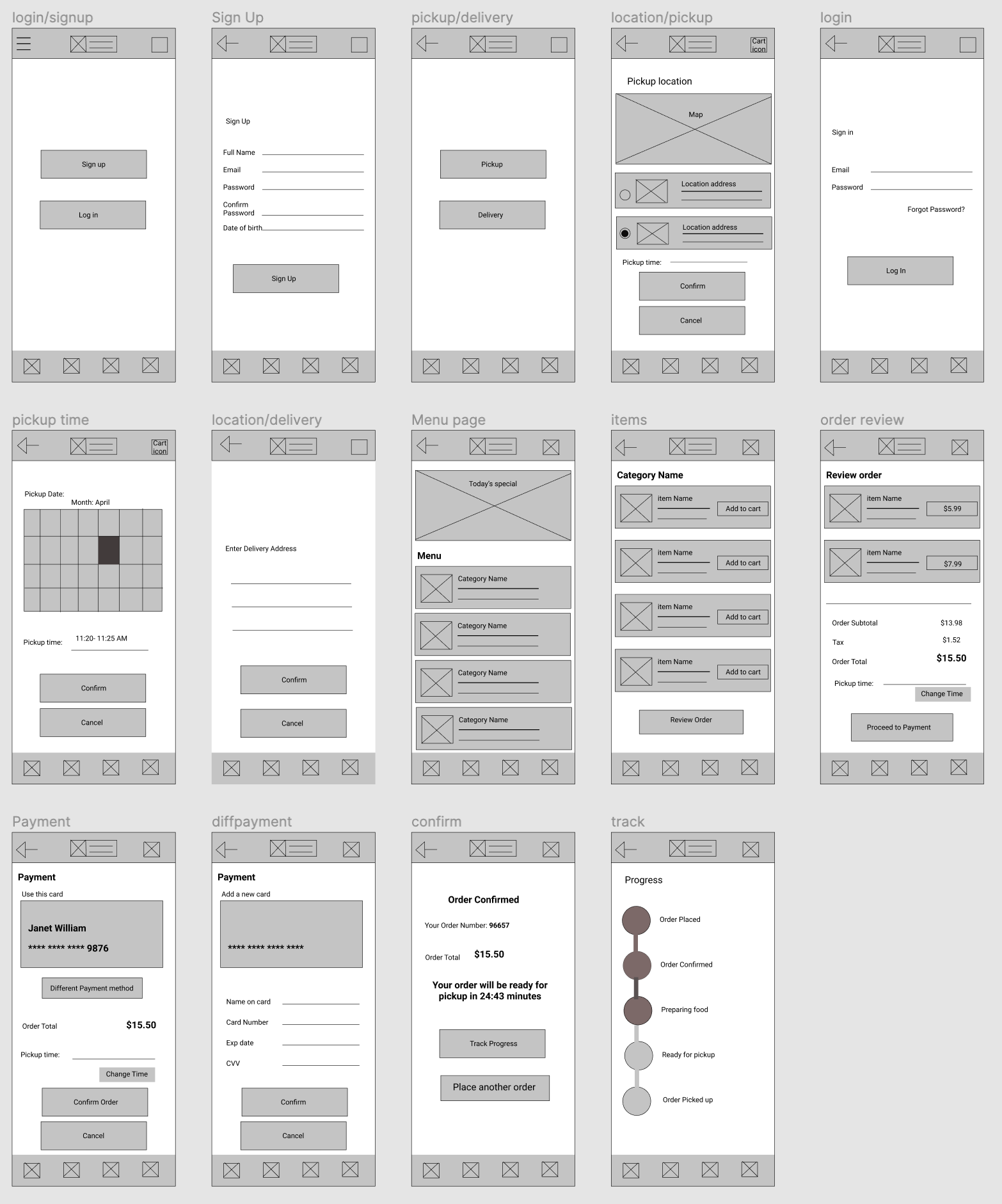
I used storyboards to explore the wider ordering context, then moved from sketches to wireframes and Figma prototypes. The flow connected choosing pickup or delivery, selecting a location and time, browsing the menu, reviewing an order, and paying.
View storyboard and early wireframes
Testing exposed gaps in scheduling control
- Format
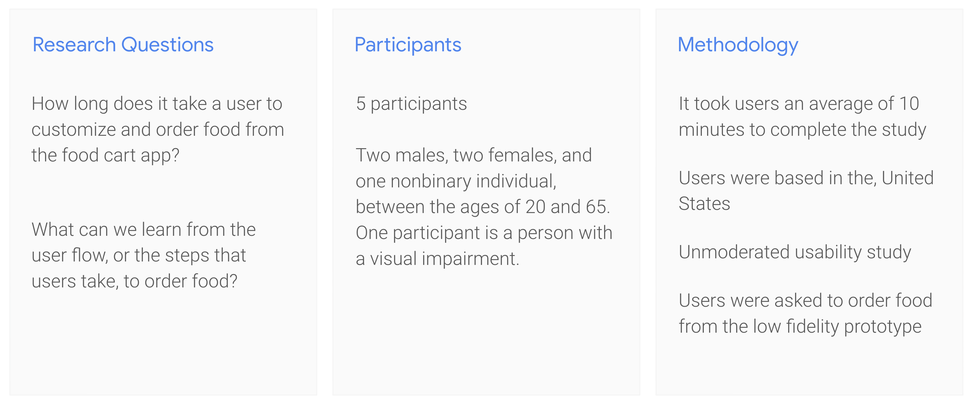
- Remote, unmoderated
- Participants
- Five, completing tasks individually
- Prototype
- Low-fidelity ordering flow
- Setting
- Participants’ homes in the United States
Five participants, aged 20–65, completed the remote, unmoderated study. The study overview records an average session duration of about 10 minutes. The research questions focused on how people customized and ordered food, and where the flow created difficulty.
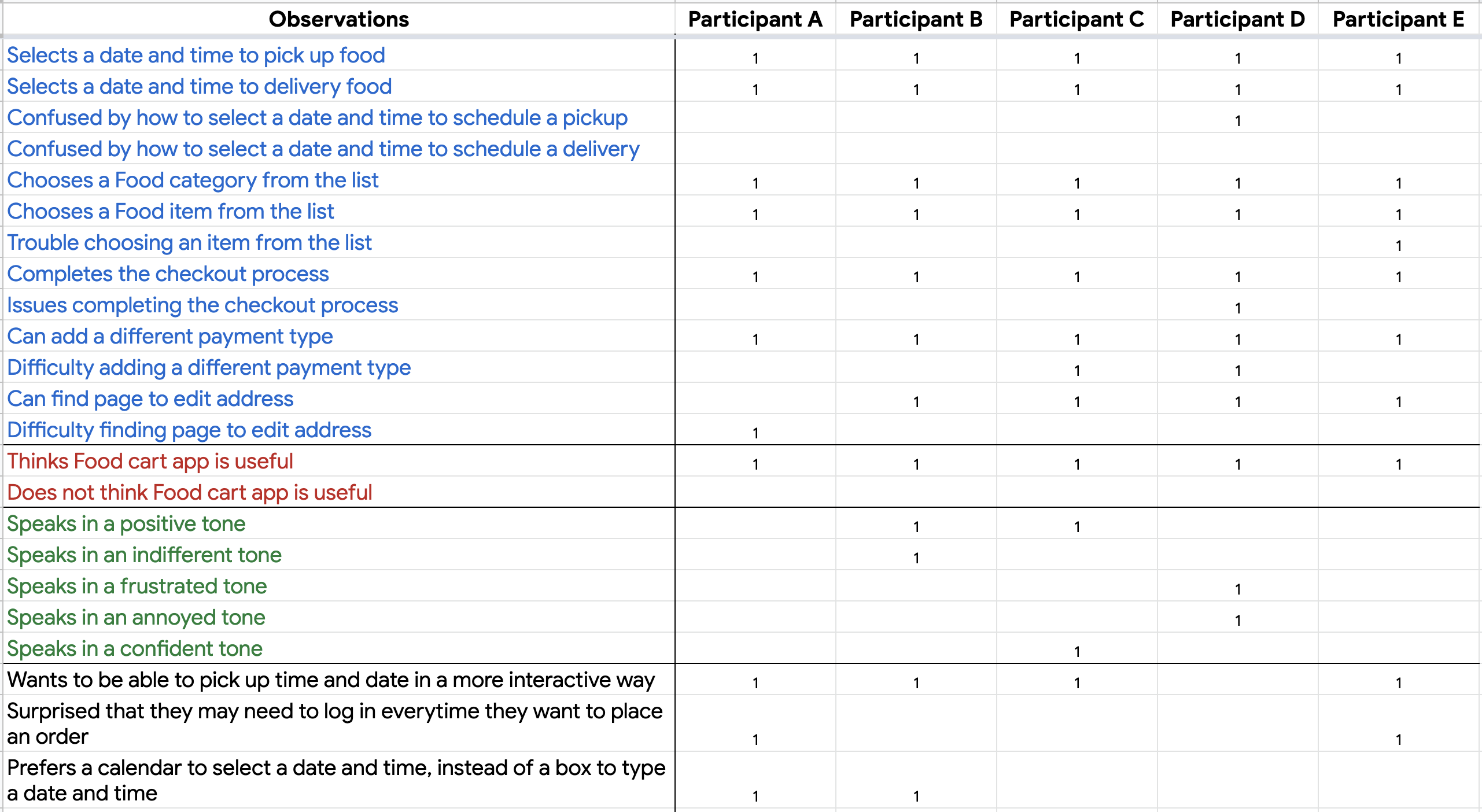
Participants worked through ordering prompts. I recorded observations about scheduling, item selection, checkout, payment changes, and address editing.
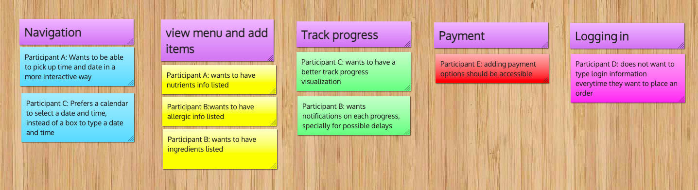
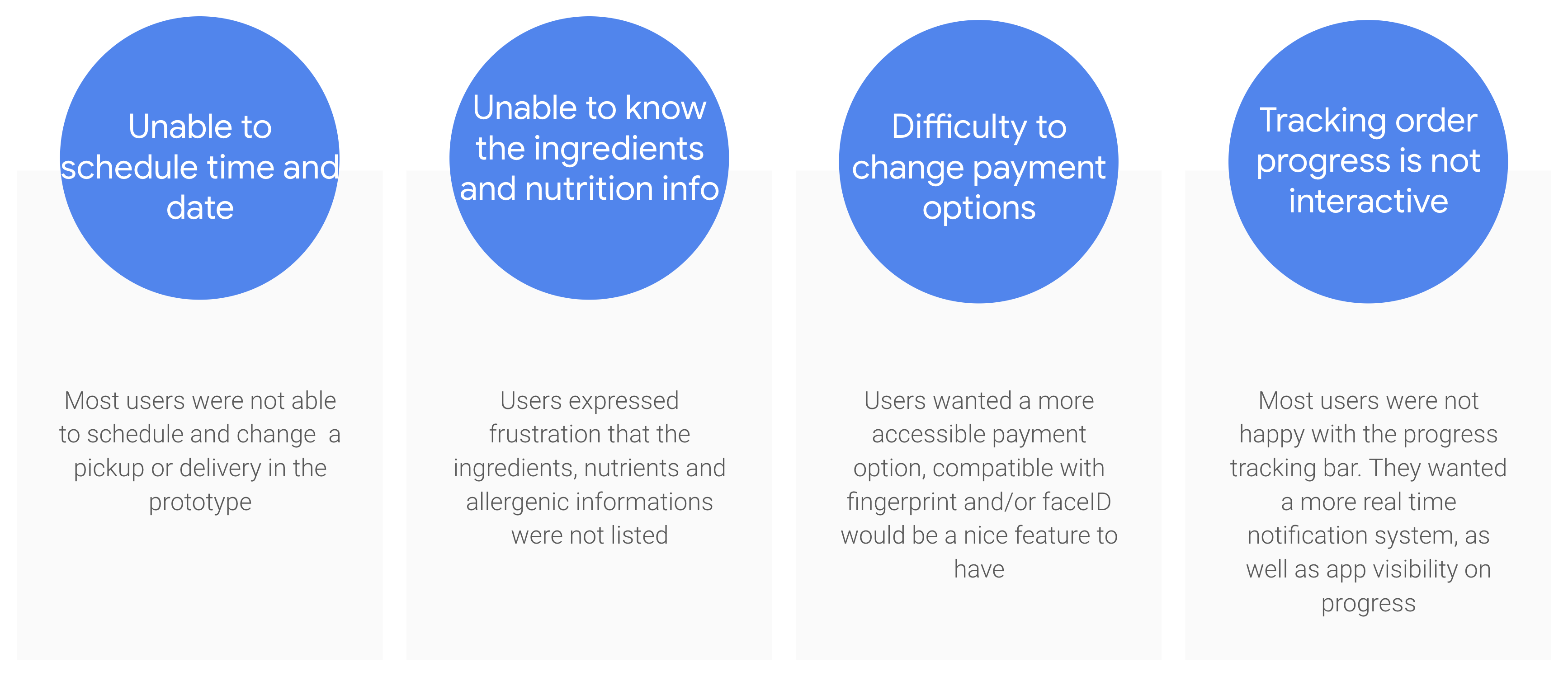
I grouped the observations into an affinity diagram and summarized the recurring themes. The observation matrix and synthesis highlighted different aspects of the experience:
- Scheduling control: four of five participants wanted a more interactive way to select a date and time; two specifically preferred a calendar.
- Payment changes: the matrix records difficulty adding a different payment type for two participants.
- Food information: the synthesis identifies missing ingredient, nutrition, and allergen details.
- Order visibility: the synthesis records requests for clearer progress updates.
These findings guided design priorities. They describe this small study and do not establish how common the issues are across a wider customer population.
View study evidence
From a time input to calendar-based scheduling
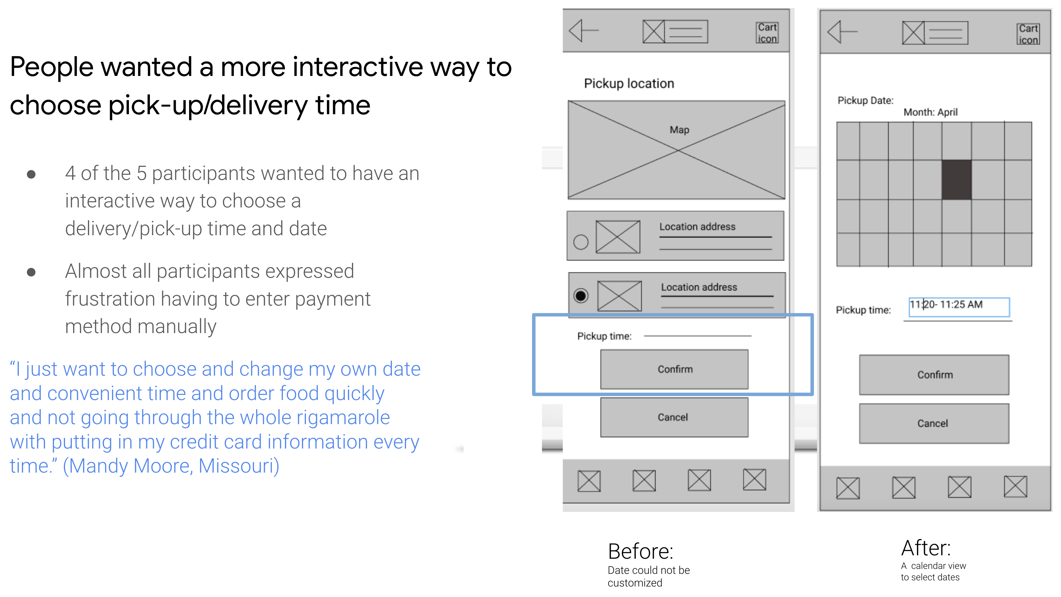
The clearest documented revision addresses scheduling. The earlier screen offered a pickup-time input without a customizable date. The revised screen introduced a calendar for selecting a date alongside the time field.
Finding → design response: four participants wanted more control over scheduling, so I made date selection an explicit step in the flow.
The comparison below shows that interface change. It does not show a measured improvement in completion time or task success.
The high-fidelity prototype
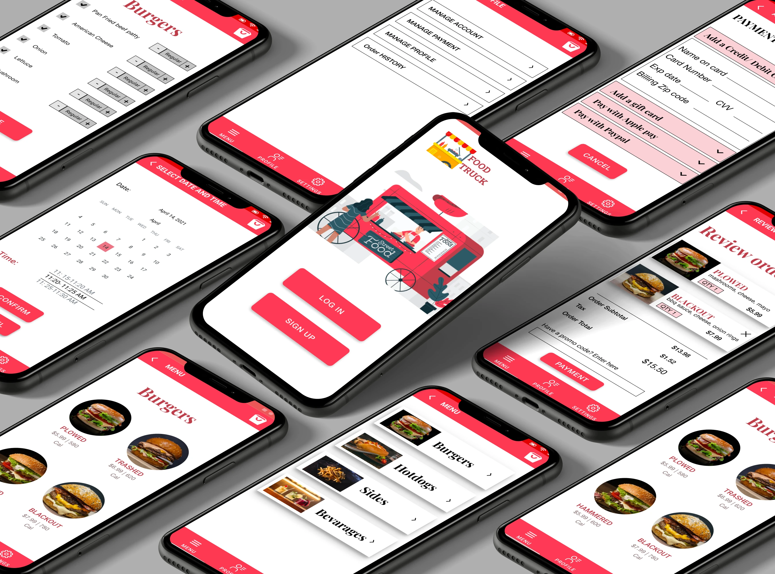
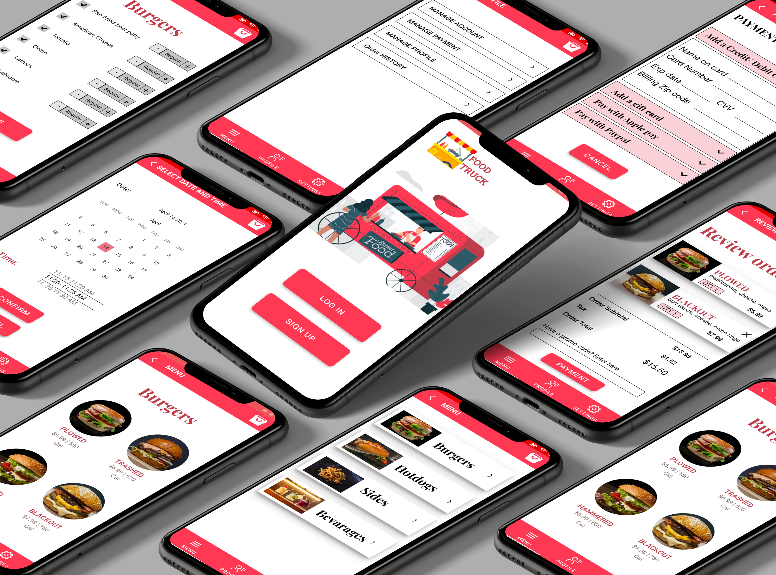
The final mockups show menu categories and prices, ingredient customization, a date-and-time selection screen, order review, and payment options. The calendar carries the scheduling revision into the visual design.
The screens also explore alternatives to manual card entry. These are prototype options; payment integrations and their usability have not been demonstrated by the mockups.
Outcome and next validation
The study showed that completing a task and feeling in control of it are different things. The observation matrix records scheduling actions while also capturing requests for a better way to choose a date and time. That distinction helped me move beyond whether a screen could be used to consider how it should work.
The deliverable is an iterated high-fidelity prototype. A follow-up study would test whether customers can select and change a pickup date, recognize the confirmed time, and complete checkout without confusion.
I would also test ingredient and dietary-information discovery, payment changes, and order-status comprehension. For accessibility, I would evaluate text contrast, touch targets, calendar navigation, and screen-reader labels in implementation. These are next steps, not completed validation.